Drop in what you like.
Screenshots of shirts you love — Pinterest, Etsy, anywhere. We study the vibe, never copy the artwork.
Drop reference images
or click to browse — PNG / JPG / WebP, multiple at once
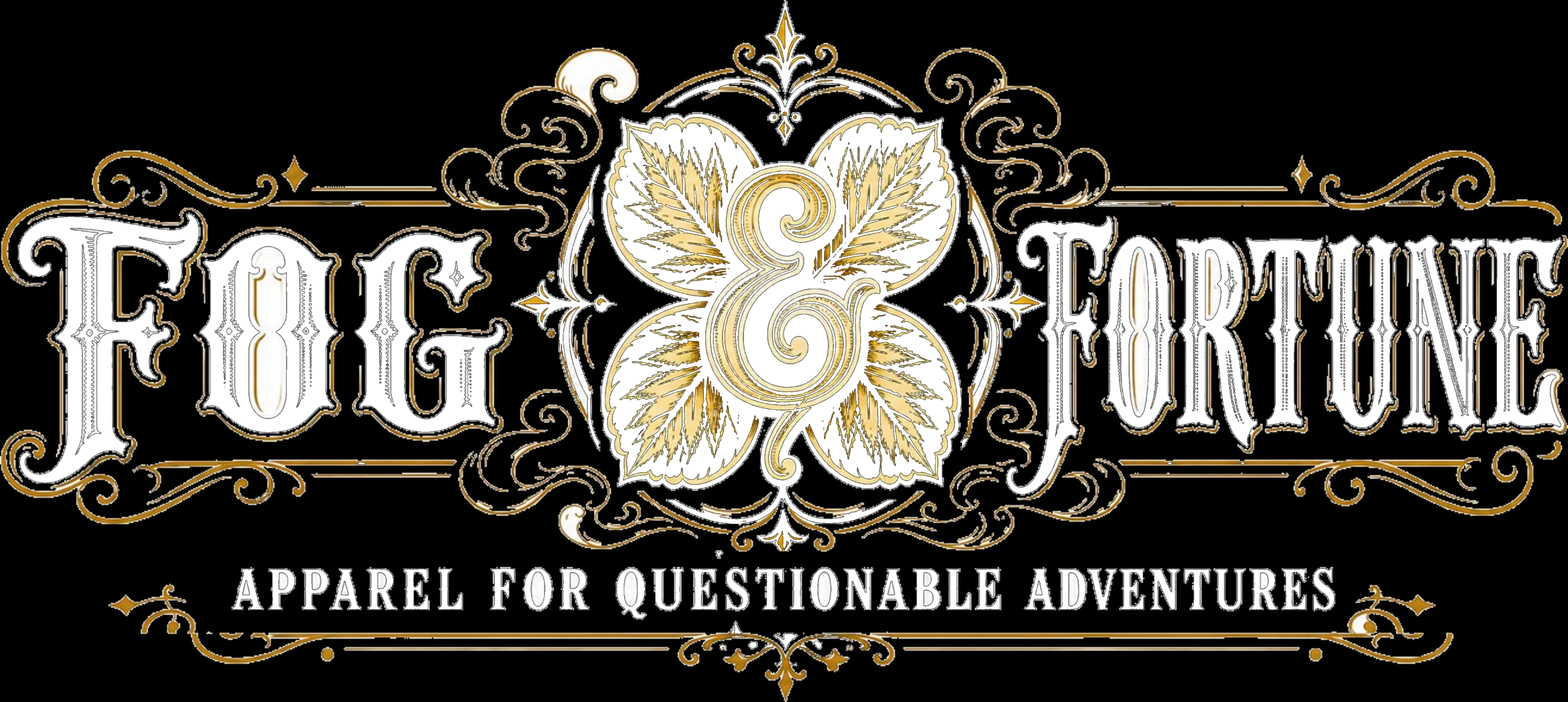
Use a central icon/emblem as a hinge between two large headline blocks.
Employ bilateral symmetry to create instant badge-like authority and premium feel.
Combine oversized vintage display serif lettering with ornate scrollwork for collectible-label appeal.
Limit palette to dark base, warm light ink, and one antique metallic accent for strong merch versatility.
Add a small secondary tagline beneath the main lockup to increase perceived brand world-building.
Use filigree extensions and divider rules to enlarge perceived print presence without adding scene complexity.
Create thumbnail impact through huge letterforms, central contrast, and a clear silhouette.
do not copy: Do not replicate the exact split-word lockup with the same wording arrangement.
do not copy: Do not copy the central oversized ampersand as the dominant emblem between matching word blocks.
do not copy: Do not reproduce the specific mirrored leaf cluster surrounding the center symbol.
do not copy: Do not imitate the exact ornamental scroll placement, especially the top/bottom flourishes and side divider lines.
do not copy: Do not reuse the tagline wording or the brand-name wording.
do not copy: Do not recreate the same overall composition with near-identical symmetry, proportions, and decorative density.
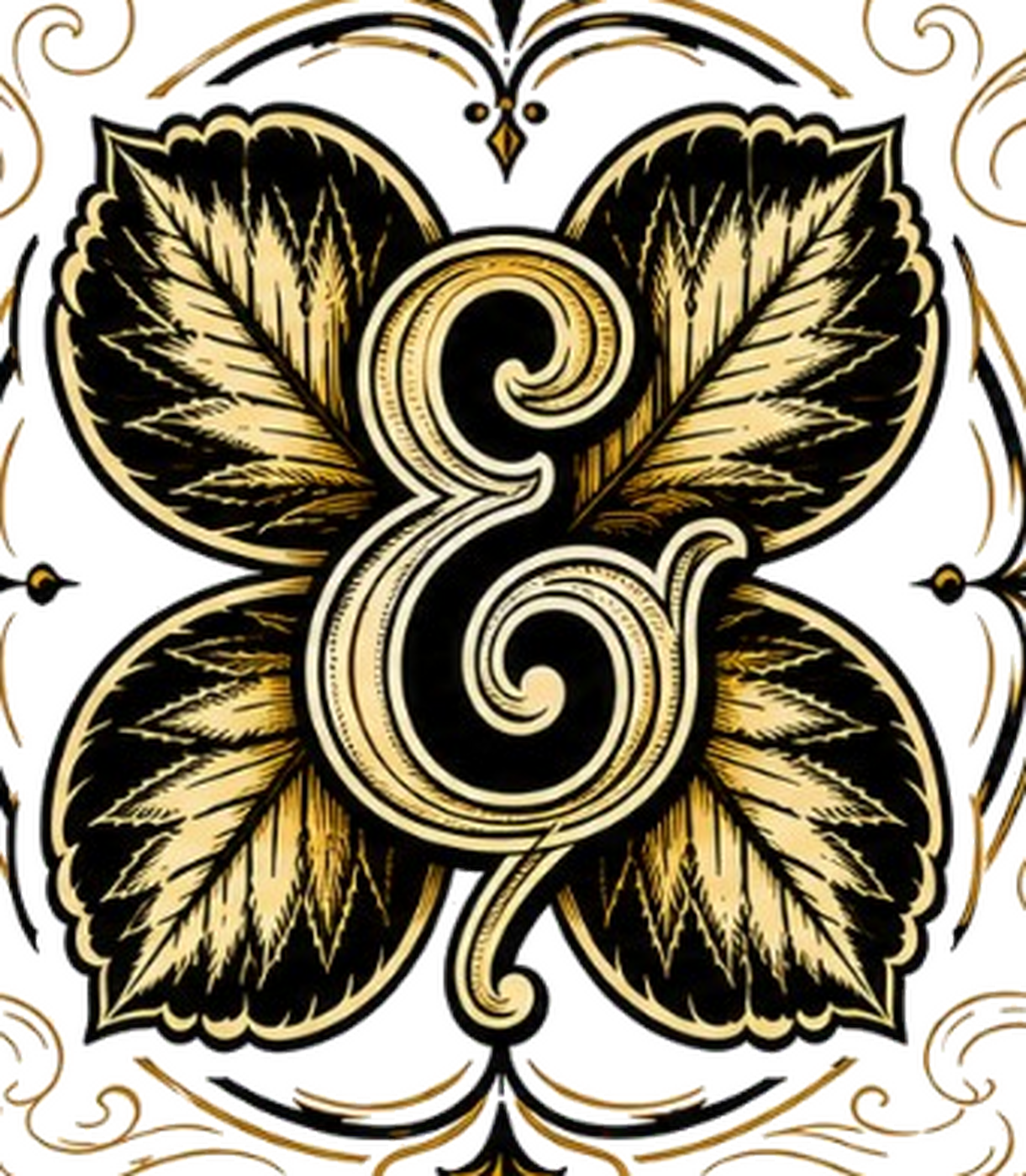
Use a single dominant central icon or wordmark with immediate silhouette recognition.
Support the hero element with mirrored secondary motifs to create badge-like symmetry.
Combine ornamental Victorian filigree with bold high-contrast outlines for premium vintage appeal.
Limit the palette to 2-4 high-contrast tones to improve print clarity and perceived collectibility.
Treat typography as an illustrative object, not just text.
Use layered outlines or inline detailing to separate key forms from busy ornamental backdrops.
Create thumbnail strength through a compact emblem rather than wide scenic storytelling.
Borrow antique label energy through engraving textures, scrollwork, and formal symmetry.
do not copy: Do not copy the exact monogram letterform or its swash structure.
do not copy: Do not reproduce the four-leaf symmetrical arrangement in the same clover-like composition.
do not copy: Do not replicate the specific perimeter filigree layout or corner scroll placements.
do not copy: Do not reuse the same botanical leaf shapes, vein patterns, or serrated contour styling.
do not copy: Do not mimic the exact layered outline pattern around the central glyph.
do not copy: Do not recreate a substantially similar centered monogram-over-leaves badge composition.
Ready?
We study your 2 images, find what they have in common, and come back with a gallery of original designs with picture previews. Takes a few minutes — the bar below keeps you posted.