Drop in what you like.
Screenshots of shirts you love — Pinterest, Etsy, anywhere. We study the vibe, never copy the artwork.
Drop reference images
or click to browse — PNG / JPG / WebP, multiple at once
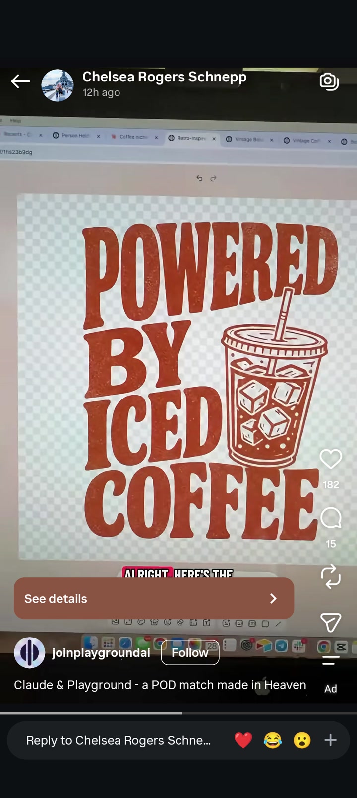
Use a bold stacked slogan with very few words for immediate readability.
Combine a large retro text block with a simple themed icon to increase click appeal.
Keep to one ink color to simplify production and support vintage styling.
Apply light distressing to make a new design feel broken-in and trend-aware.
Create hierarchy by varying line width and letting the bottom word act as a visual base.
Use a relatable consumable or hobby object as a shorthand identity marker.
Favor broad shapes and high contrast over intricate detail for strong marketplace thumbnails.
do not copy: Do not reuse the exact phrase shown in the reference.
do not copy: Do not replicate the same four-line wording structure with the same beverage theme and message.
do not copy: Do not copy the specific arrangement of oversized stacked text with a cup illustration inserted on the right side of the middle lines.
do not copy: Do not duplicate the specific vintage serif letterform selection or a substantially similar font pairing.
do not copy: Do not recreate the same iced cup drawing with similar lid, straw, and ice-cube composition.
do not copy: Do not imitate the overall composition so closely that it appears to be the same design with swapped words.
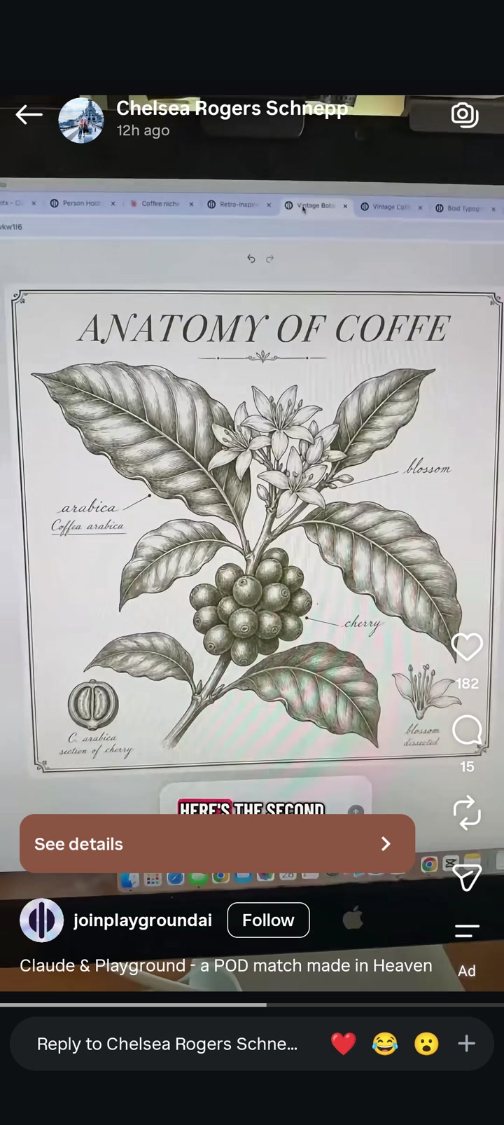
Use of faux-scientific taxonomy formatting to elevate a hobby or consumable subject.
Centered hero specimen with educational callout labels creates immediate readability.
Large elegant title plus detailed natural object produces a giftable, premium-looking aesthetic.
Vintage archival styling increases perceived sophistication and broad marketplace appeal.
Inset detail studies add authenticity and make the design feel collected or scholarly.
Minimal palette and strong central silhouette support visibility even with intricate illustration.
do not copy: Do not reuse the exact title phrase shown in the reference.
do not copy: Do not replicate the coffee plant subject matter with matching labeled parts in the same arrangement.
do not copy: Do not copy the specific combination of central branch, clustered fruit, blossoms, and corner inset studies.
do not copy: Do not reproduce the same border treatment with matching ornamental corners and identical spacing.
do not copy: Do not reuse the visible species name or scientific nomenclature shown in the artwork.
do not copy: Do not mimic the same label words and leader-line placements.
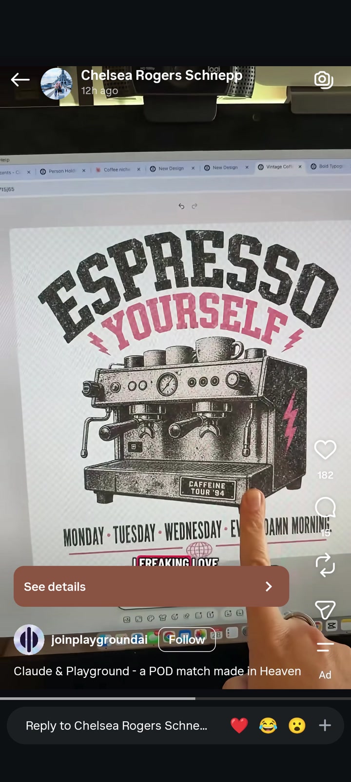
Use a large arched headline to establish attitude before the viewer processes details.
Pair a bold slogan with one highly recognizable niche object for instant audience targeting.
Apply a faux-vintage distressed treatment to make a new graphic feel collectible or tour-inspired.
Use a limited accent color to create thumbnail pop without increasing visual complexity.
Extend the main joke with smaller sub-copy for shoppers who zoom in, while keeping top-level readability strong.
Mix rugged industrial illustration with playful text color to broaden appeal.
Center everything tightly for compatibility with standard POD front-print zones.
Include tiny pseudo-merch details such as a label or badge to imply world-building and authenticity.
do not copy: Do not reuse the exact phrase structure or wording shown in the headline/subheadline.
do not copy: Do not copy the specific espresso-machine illustration pose, detailing, or overall composition.
do not copy: Do not reproduce the pink lightning-bolt placements or matching accent arrangement.
do not copy: Do not replicate the exact day-of-week sub-copy line or profanity-based morning phrase.
do not copy: Do not reuse the small machine plate text or faux-tour date treatment.
do not copy: Do not recreate the same stacked hierarchy with near-identical arches, central machine, and bottom copy combination.
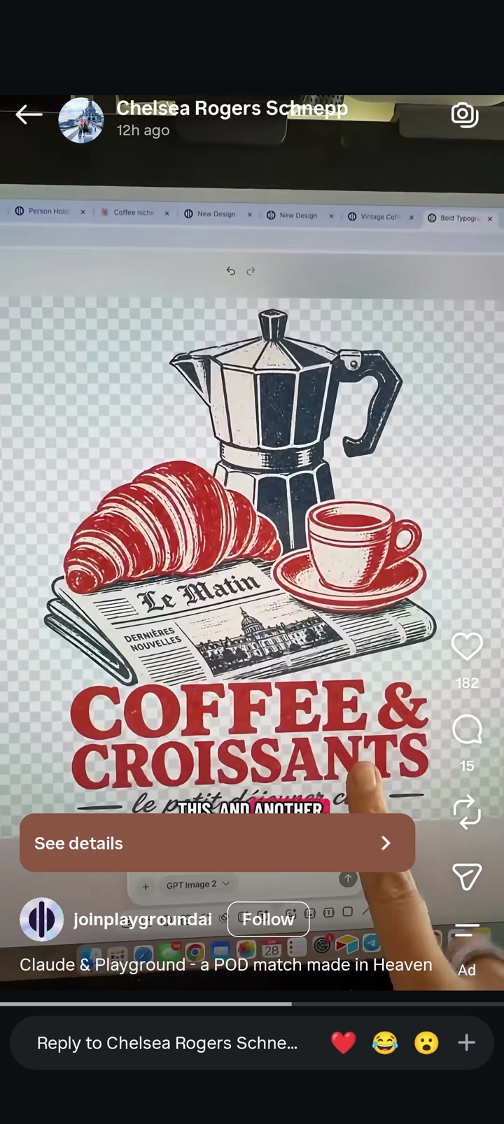
Stack a nostalgic object cluster above an oversized slogan for instant category recognition.
Use limited-color vintage illustration to create perceived premium style without complex production.
Pair food or drink iconography with bold serif headline typography for strong marketplace readability.
Ground floating objects with a base prop to unify the composition.
Combine retro editorial cues and distressed textures to imply authenticity and lifestyle appeal.
Use one dominant accent color across both imagery and type to keep the design cohesive.
Center-aligned, compact compositions translate well to t-shirt chest placement and thumbnails.
do not copy: Do not copy the exact object arrangement of espresso maker above pastry and cup over newspaper.
do not copy: Do not reproduce the exact large headline wording.
do not copy: Do not reuse the French newspaper masthead wording or faux newspaper layout.
do not copy: Do not duplicate the same red serif headline style in the same arrangement with the same supporting script line.
do not copy: Do not recreate the same café breakfast subject combination in substantially similar composition.
do not copy: Do not copy the distinctive vintage newspaper plus pastry plus coffee tableau.
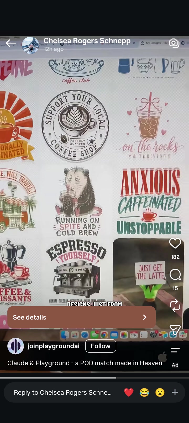
Pair a lifestyle identity statement with a universally recognizable hobby object.
Use stacked slogan lines with one dominant emotional adjective per line for fast readability.
Combine sarcasm or frazzled mood language with comforting beverage imagery.
Use circular seal/badge compositions to imply community, craft, or local pride.
Mix bold condensed capitals with softer script for contrast and personality.
Insert a small icon between text lines to break up the stack and add charm.
Apply muted vintage colors plus selective strong accent hues to feel trendy but wearable.
Use distressed or handmade texture to avoid flat generic typography.
Center compositions tightly so they function well as standalone chest prints in marketplaces.
Leverage cute-but-exhausted character energy to connect with overworked adult audiences.
do not copy: Do not reuse any exact visible phrases from the reference.
do not copy: Do not replicate the circular 'support local coffee shop' badge composition with central latte art and ring text.
do not copy: Do not copy the stacked three-line phrase layout using the exact emotional-word progression and cup divider.
do not copy: Do not reproduce the animal-holding-cold-drink illustration pose or facial expression.
do not copy: Do not duplicate the takeaway cup with heart doodles and script-below arrangement.
do not copy: Do not copy the espresso machine artwork paired with arched headline text.
do not copy: Do not reuse any exact café object arrangements, icon shapes, or ornamental framing that are substantially similar.
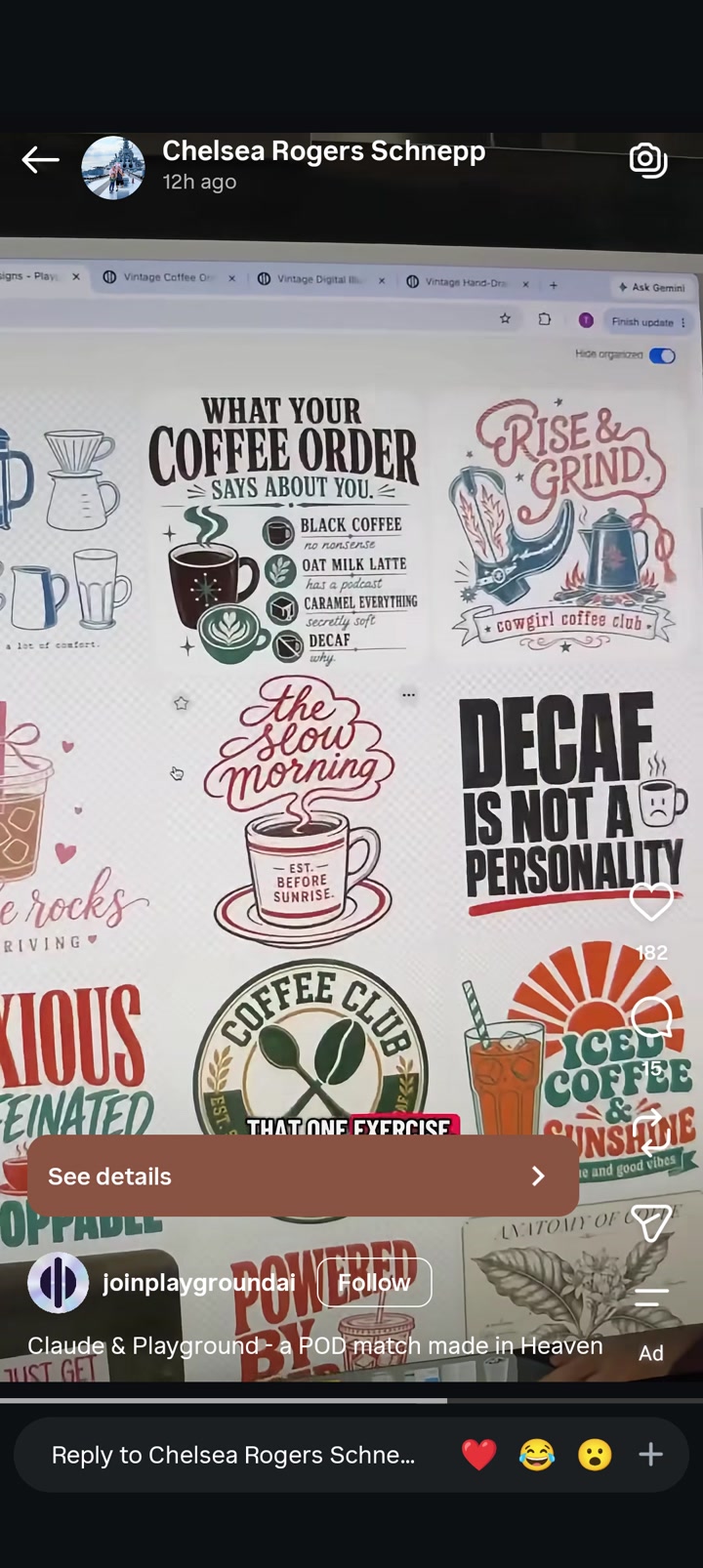
Use a single lifestyle obsession as the anchor theme and build a short punchline around it.
Combine heavy all-caps statement type with one softer script element to broaden appeal.
Pair one central icon with stacked text for fast mobile-thumbnail readability.
Use niche-mashup motifs to create giftable identity products.
Favor retro muted palettes that signal cozy lifestyle branding.
Employ badge, seal, or club-style framing to create belonging and collectible energy.
Keep illustrations simple and symbolic so text remains the main seller.
Add tiny decorative accents like steam, stars, sparkles, rays, or leaves to increase perceived completeness without clutter.
Use contrast between assertive humor and comforting beverage imagery.
Build designs that read clearly in a marketplace grid from a distance.
do not copy: Do not copy any exact phrases visible in the reference.
do not copy: Do not recreate the specific coffee-order chart structure with the same wording pairings.
do not copy: Do not reproduce the western coffee composition featuring hat/boots/kettle arrangement and matching phrase/banner setup.
do not copy: Do not duplicate the exact stacked block-text composition of the decaf slogan design.
do not copy: Do not copy the circular coffee club badge with matching utensil-and-bean arrangement.
do not copy: Do not reuse the exact script composition and cup arrangement of the slow-morning design.
do not copy: Do not replicate any individual illustration, icon arrangement, or near-identical color blocking from the reference.
Ready?
We study your 6 images, find what they have in common, and come back with a gallery of original designs with picture previews. Takes a few minutes — the bar below keeps you posted.